Studio 3807 Wardrobe Suggestions
Usually I don’t give specific outfit advice as locations are typically selected after wardrobe is decided- but since our location is set, I wanted to share a bit more guidance to make sure your final photos are cohesive!
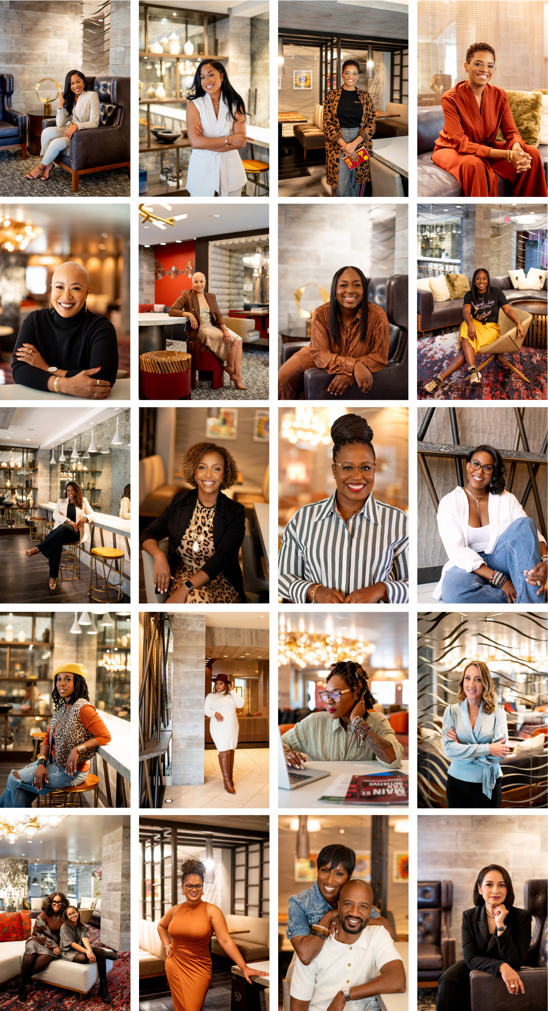
Since our location has a lot of warm tones and textures, the only colors I suggest staying away from would be brights (hot pink, neon yellow, cobalt blue, kelly green, etc) as those would clash with our backdrop.
Neutrals and fall colors tend to work well, but don’t think you HAVE to go with brown. Check out the photos below to see some of the past colors and wardrobe selections we’ve done here!
I can’t wait to see what you come up with! Looking forward to creating with you soon 🤎